LOQL.io
Live URL: https://www.loql.io/
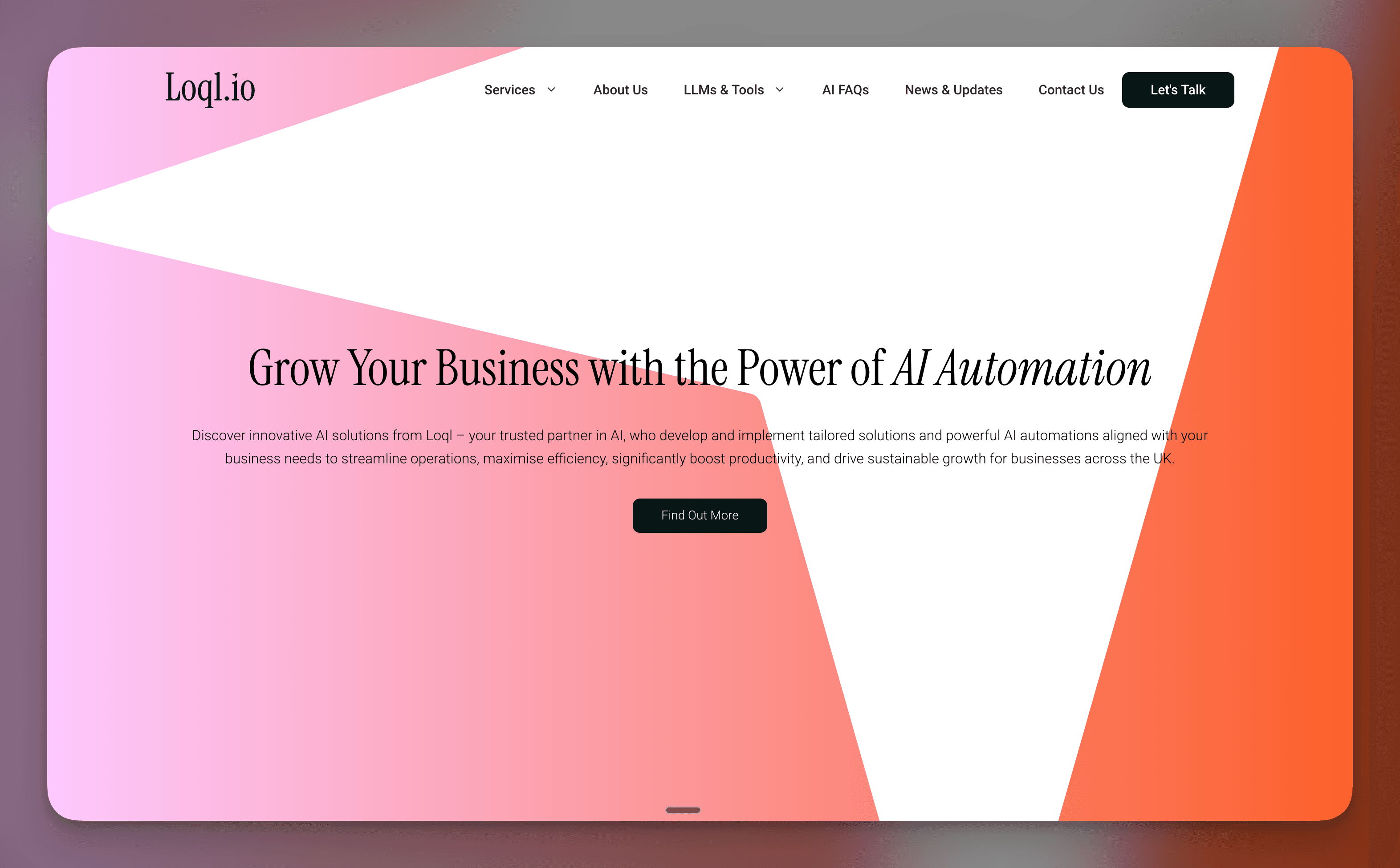
A service-led product story about shaping positioning, offer clarity, and lead flow for an AI automation consultancy website.
The core challenge behind LOQL.io was not a lack of capability. It was translation. Most visitors arrived with vague expectations about AI, while the business needed to communicate specific, implementation-ready outcomes across operations, sales, and support.
What we were solving
From a product and messaging standpoint, the first problem was qualification. If every service sounded like generic 'AI consulting', users could not confidently decide what fit their use case. We needed clearer entry points that mapped to real business jobs instead of abstract technology labels.
The second problem was trust progression. A consultancy site cannot depend on one hero section to convert. It has to sequence proof, scope, and next-step clarity so a cold visitor can quickly understand what gets delivered, for whom, and how to start without friction.
Build scope
- Offer and messaging structure for AI automation consultancy positioning
- Service-page architecture for operations, marketing, and support use cases
- SEO-aware content pathways tied to commercial intent and lead routing
- Conversion path design from discovery to enquiry submission
System and workflow design
We treated the site like a decision system rather than a brochure. Service pages, supporting content, and navigation all worked together to answer a progression of user questions: what is this, does it apply to me, is it credible, and what do I do next.
Offer architecture centered around outcome-led categories such as automation, AI agents, and implementation support. This gave the information structure enough specificity for qualified leads while still keeping the top-level experience easy to scan.
Content and SEO surfaces were built as practical discovery routes, not traffic vanity pages. The objective was to capture high-intent searches and route those visitors into clear commercial paths with minimal ambiguity about scope.
Lead capture was intentionally integrated into the service narrative so enquiry points appeared after context, not before it. That sequencing made forms feel like a logical next step rather than an interruption.
Step 01
Position
What does this team actually deliver?
The first step was reducing ambiguity in the core offer. We focused on outcome language and practical categories so visitors could quickly self-identify whether the service matched their current business bottleneck.
Step 02
Qualify
Is this relevant to my use case?
Once the offer framing was clear, the site needed to help visitors qualify fit without a sales call. Service pages and supporting context were structured to answer applicability, scope, and expected implementation direction early.
Step 03
Convert
What is the next action?
Enquiry flow came after clarity and trust signals. We placed conversion prompts where users had enough information to act, which improved intent quality and made next steps feel direct rather than premature.
How the user moved through the product
Discover a pain point
A visitor lands on the site through search, referral, or direct traffic with a broad need like automation or AI enablement. The homepage immediately frames the problem space in business terms so they can orient quickly.
Find a service match
Navigation and service sections guide the visitor toward the most relevant capability area. Instead of forcing technical interpretation, the site maps services to common operational and growth outcomes.
Validate credibility
Supporting pages and explanatory content provide the confidence layer: what is included, how delivery works, and why the approach is practical for real-world teams.
Submit an enquiry
After offer and fit are understood, the user reaches a clear contact path. The form step is positioned as a continuation of the decision process, not a dead-end generic lead box.
What we learned building it
Outcome language beats AI buzzwords
Positioning improved when we described concrete results and workflows instead of relying on broad AI terminology. Visitors could evaluate fit faster when the copy matched business problems they already recognized.
Service clarity is a conversion lever
A well-structured service architecture reduced hesitation across the funnel. Users moved more confidently when each page answered scope, relevance, and expected next steps without requiring extra interpretation.
Trust has to be sequenced, not assumed
Conversion improved when proof and delivery context were distributed through the journey instead of concentrated in one section. Progressive trust cues supported deeper page engagement and stronger lead intent.
Lead forms perform best after qualification
Placing enquiry CTAs after clear context increased the quality of inbound conversations. The site worked best when users reached the form with a formed expectation of what collaboration would involve.