Visa Document Checker
Live URL: https://visadocumentchecker.com/
A product and engineering build story about shaping the workflow, decision logic, pricing surfaces, and support experience for a visa-prep SaaS.
While building Visa Document Checker, we kept returning to the same product problem: visa applicants were not failing because they lacked effort, they were failing because the process was opaque, document quality was hard to judge, and most of the important mistakes only became visible when it was already expensive to fix them.
What we were solving
From a product perspective, that meant we could not stop at publishing a checklist. We needed to build a system that translated embassy-specific requirements into a usable workflow, exposed readiness in a way users could act on, and reduced the cognitive load between knowing something is wrong and knowing what to do next.
That pushed the MVP toward a tighter operating model: first establish requirements, then evaluate document strength, then open a guided support layer for improvement. We were deliberately designing for progression, not feature depth, because clarity was the real bottleneck at this stage.
Build scope
- Offer positioning and message clarity for a high-stakes immigration workflow
- Embassy-aware checklist and document-review product flow
- Pricing, guarantee, and support structure for solo, family, and enterprise use
- Blog and FAQ content architecture to answer common rejection risks up front
System and workflow design
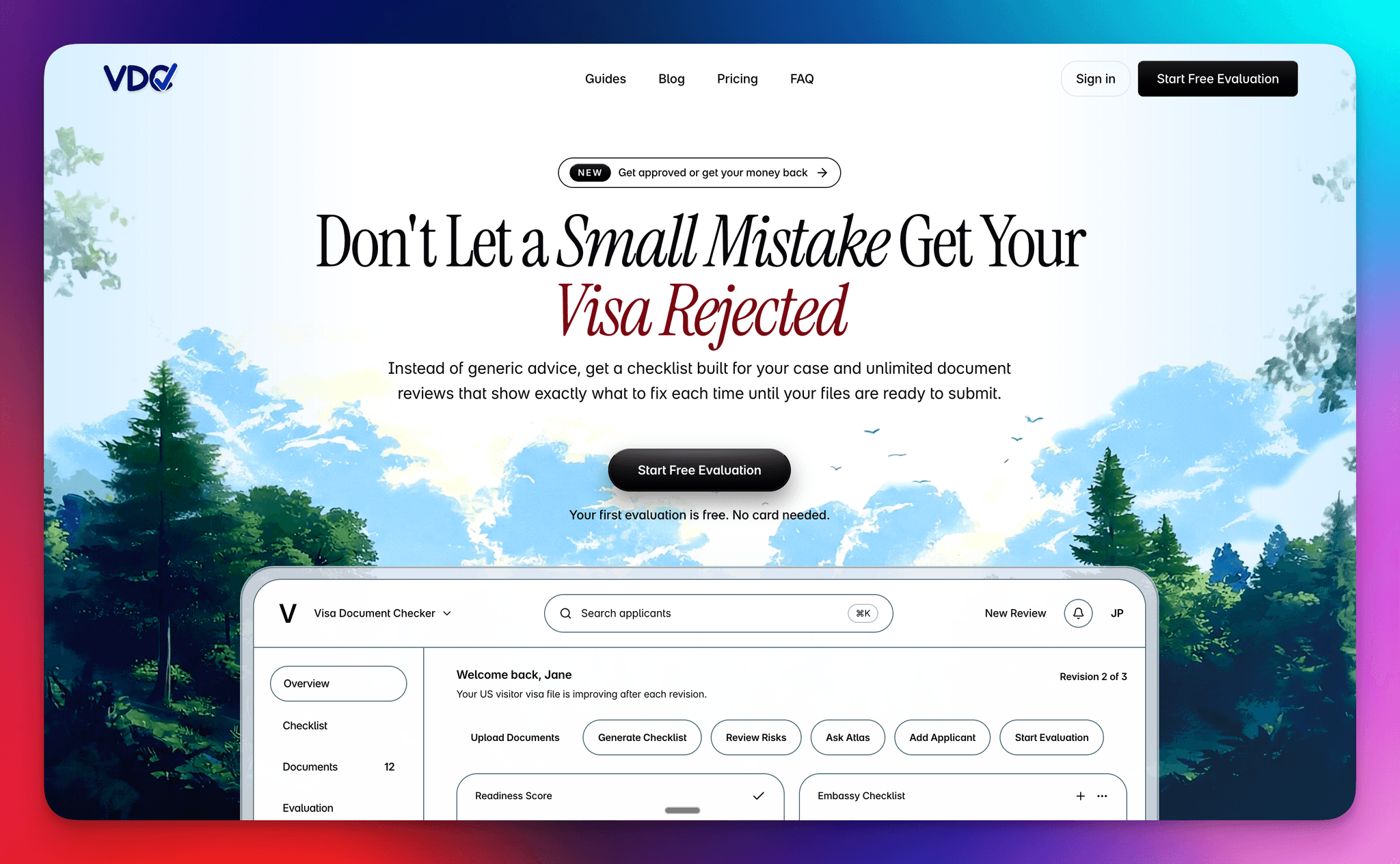
Under the hood, we treated the product as a workflow state machine rather than a set of disconnected features. Checklist, evaluation, and Atlas each had to earn their place in sequence, with the UI making it obvious what was ready, what was blocked, and what the highest-leverage next action was.
That meant the checklist was not only content generation. It was the first system boundary: gather destination, visa type, applicant context, and embassy, then turn that into a concrete document set the user could work against. From there, uploads became structured input for evaluation rather than a loose document bucket.
Evaluation was where product logic and technical logic met. Once the right documents were present, the system could generate a readiness signal, surface red flags, and move the user from collection into judgment. That is the point where the app started behaving less like storage and more like decision support.
Atlas sat after evaluation by design. We did not want chat to become a vague first step. By placing it downstream of uploads and scoring, the support layer had context to work from, and the user had a concrete reason to ask the next question. Even at MVP stage, that sequencing made the experience feel more coherent.
Step 01
Checklist
What documents do I need?
We started with the checklist because orientation had to come before analysis. The product needed to generate embassy-aware requirements that felt specific and operational, not generic content. In practice, this meant treating the checklist as the first decision layer in the system rather than a passive reference page.
Step 02
Evaluation
How strong is my application?
Once documents were uploaded, the product had to move from collection to judgment. Evaluation became the core product moment because it translated raw uploads into a readiness signal: risk, weak spots, strengths, and next actions. That shift is what turned the workflow from storage into applied decision support.
Step 03
Atlas
How do I improve weak spots?
We added Atlas because a score on its own is rarely enough. After evaluation, users still needed a place to interrogate the result, pressure-test specific documents, and ask follow-up questions in context. Product-wise, Atlas was our way of extending the workflow from assessment into guided iteration.
How the user moved through the product
Generate checklist
A user starts by creating an application with destination, visa type, and embassy context. The system then generates an embassy-aware checklist so the first screen already answers a practical question: what is required for this case, not for visas in general.
Upload documents
Instead of dropping users into a generic file manager, the product ties uploads to the checklist itself. That keeps the workflow grounded in completeness: users can see what is present, what is still missing, and why they are not yet ready to move forward.
Run evaluation
Only after the required set is in place does evaluation unlock. That gate reduced premature analysis and made the score feel more legitimate, because the system was evaluating a real submission state rather than an incomplete draft.
Refine with Atlas
Once evaluation has surfaced risk, Atlas becomes the place to interrogate the result. At that point the user is no longer asking broad questions about visas; they are asking document-aware follow-ups grounded in the actual case and the weak spots the system has already identified.
What we learned building it
Linear flow reduces hesitation
The three-step structure did more than simplify navigation. It reduced hesitation at the product level because users did not need to build their own mental model of the system before getting value. The flow itself explained where to start, what was unlocked next, and why.
Gates improve output quality
We deliberately gated evaluation until required documents were uploaded. That constraint was not only a UX choice, it was a product-quality decision. Better inputs produced better outputs, and the workflow prevented users from asking the system for certainty before the evidence was there.
Clear next actions matter as much as analysis
We learned that analysis is only half the job. A product like this needs to convert diagnosis into motion. Progress states, workflow labels, and next-action prompts mattered because they helped users move from 'I see the issue' to 'I know what to do now' without dropping out of the flow.
Multi-applicant support matters earlier than expected
We treated family and dependent cases as a first-class product shape earlier than we normally would in an MVP. That decision added complexity, but it also made the system more realistic. Real visa workflows are often shared, parallel, and messy, and the product became stronger once we designed for that from the beginning.